9 dicembre forconi: Deficit Spending
Visualizzazione post con etichetta Deficit Spending. Mostra tutti i post

martedì 18 settembre 2018

Ticking Time Bomb: US Govt Spends Nearly Half A Trillion Dollars This August Alone

The government has just spent nearly 40% more this August than last. Here are the details of a budget deficit that is starting to blow-up…
from Zero Hedge
Two days ago we previewed the the US budget deficit for the first 11 months of fiscal 2018, which according to CBO data, hit $895 billion, up $222 billion or 39% from the same period last year. Additionally, we noted that according to CBO calculations, the US would hit a $1 trillion deficit in calendar 2019, one year sooner than the previous forecast of 2020.
Today, the US Treasury released the detailed budget deficit breakdown for the month of September and the first 11 months of the year, and the numbers are scary.
According to the latest Monthly Treasury Statement, in August, the US collected only $219BN in tax receipts – consisting of $106BN in individual income tax, $93BN in social security and payroll tax, a negative $3BN in corporate tax and $24BN in other taxes and duties- a drop of 3.2% from the $226BN collected last August…
… but more concerning was that in August, the 12 month trailing receipt total was barely higher compared to a year ago, up just 0.3% Y/Y after rising as much as 3.1% at the end of 2017, and on the verge of turning negative year over year.
The real highlight of the August budget report was that government outlays, or total spending, soared to $433.3 billion, not only 30% higher than a year ago, but the highest government monthly outlay of any month on record.
This is where the money was spent: social security ($108BN), defense ($65BN), Medicare ($83BN), Interest on Debt ($32BN), and Other ($146BN).
This resulted in a August budget deficit of $214 billion, which was not only one of the highest one-month deficits on record, but also the highest August deficit on record.
The August deficit brought the cumulative 2018F budget deficit to over $898BN during the first 11 month of the fiscal year, up a whopping 40% over the past year.
This was the highest 12 month cumulative deficit since February 2013; as a reminder the deficit is expect to increase further amid the tax and spending measures, and rise above $1 trillion as soon as next year.
And while the August numbers had a few calendar quirks, until recently Most Wall Street firms forecast a deficit for fiscal 2018 – which closes on September 30 – of about $850 billion, a number which has already been surpassed by $50 billion, at which point things get… much worse. As we showed In a recent report, CBO has also significantly raised its deficit projection over the 2018-2028 period.
But while out of control government spending is clearly a concern, an even bigger problem is what happens to not only the US debt, which recently hit $21.3 trillionbut to the interest on that debt, in a time of rising interest rates.
As the following chart shows, US government Interest Payments are already rising rapidly, and just hit an all time high of $538 billion in Q2 2018.
Interest costs are increasing due to three factors: an increase in the amount of outstanding debt, higher interest rates and higher inflation. Needless to say, all three are increasing; furthermore, a rise in the inflation rate boosts the upward adjustment to the principal of TIPS, increasing the amount of debt on which the Treasury pays interest, turbocharging the amount of interest expense.
The bigger question is with short-term rates still just around 2%, what happens when they reach the mid-3% as the Fed’s dot plot suggests it will?

domenica 16 settembre 2018

Goldman: What Is Going On In The US Is "Usually Reserved For Times Of War"

Back in February, when the world was starting to become familiar with the trajectory of US debt and deficit spending under Trump's fiscal plan, we showed a chart from Goldman which made a troubling forecast: the US fiscal situation was headed for "banana republic" status, or as Goldman put it more politely, "uncharted territory" as a result of soaring federal debt and interest expense.
Now, in a follow up report, Goldman economist Alec Phillips identifies the key risks that will worsen the "already-grim" US fiscal outlook (which he defines simply as "not good"). As a reminder, just yesterday we reported that the US fiscal deficit has resumed its surge, rising 40% Y/Y to $898BN for the first 11 months of the year, following the biggest monthly outlay by the US government in history.
Goldman - which now projects a $1.05tn deficit (4.9% of GDP) for FY2019 - picks up on this and writes that its expects that figure to rise significantly over time, reaching 5.5% of GDP by 2021 and 7% of GDP by 2028. This, Goldman adds ominously, "puts US fiscal policy in  uncharted territory in two respects." 
First, running such a large primary deficit (federal revenues minus spending, not counting interest expense) in a period of strong growth and low unemployment is quite unusual, and according to Goldman is "generally reserved for times of war" as shown in the chart below.
Second, the high (and rising) federal debt-to-GDP ratio "comes at a time when interest expense looks likely to rise substantially as well." This is a similar argument to what Goldman noted back in February, and it also points out that the US also ran a very high debt-to-GDP ratio during World War II, but at the time borrowing costs were fairly low. While Goldman concedes that federal interest expense has been elevated before as well, most recently during the “bond vigilante” era of  the 1990s, "the level of federal debt was low then and the primary deficit was relatively small. Over the next decade the US is likely to face both extremes at the same time."
The gloom continues from Goldman, which next notes that not all of this is due to policies enacted in this Congress, and is one of the few to remember that US debt actually doubled under the previous administration:
In fact, the relationship between the deficit and unemployment rate began to diverge during the Obama administration, as Congress began to loosen its grip on spending and revenues increased by less than they typically do at this point the economic cycle.
That said, the current admin isn't much better, and Goldman says that "much of the deterioration in the outlook has occurred more recently, however. Congress has eased fiscal policy substantially over the past year, by cutting taxes by 1.5% of GDP in FY2019 and 0.6% over the next ten years, lifting the caps on defense and non-defense discretionary spending (0.7% in FY2019) and approving additional emergency spending (0.4%). This fiscal easing should boost GDP growth by around 1pp in 2018, but we expect the boost to taper after Q4 of this year, as the growth effects of the tax cuts and spending increase fade."
One big near-term catalyst for the US fiscal trajectory is what happens during the midterms: the bank, which previously predicted that Democrats would win control of the House as the GOP retains the Senate, notes that "the midterm election result could influence the outlook somewhat" as divided government (our base case) "would lead to a slightly negative-to-neutral fiscal impulse by 2020."  Even if Republicans maintain majorities in the House and Senate, Goldman would expect a slight additional easing as modest tax cuts could be enacted through the reconciliation process; but even in that case, "the fiscal effects on growth should be only modestly positive under such a scenario, if positive at all."
So what is the worst that could happen?
Phillips explains that Goldman's "base case" is for congress to extend expiring tax cuts and to maintain current levels of discretionary spending in real terms. In this scenario, the deficit will reach 7% of GDP by 2028 and federal debt will reach 104% of GDP. This, however, is a more positive outcome than several potential alternative scenarios Goldman has analyzed which include:
  • 1. Business as usual. Our baseline scenario calls for a small amount of passive fiscal tightening through “real bracket creep” in the tax code, which refers to the tendency for revenues to rise as a share of GDP as real incomes rise; and through roughly flat real discretionary spending growth, which reduces the level as a share of GDP. However, this is more restrictive than the typical action from Congress. If instead we assume a business-as-usual scenario that holds revenues and discretionary spending constant as a share of GDP, federal debt would be 7pp higher as a share of GDP by 2028 than our current baseline.
  • 2. Lower growth and an adverse interest rate-growth differential. If interest rates exceed nominal growth when the level of public debt is high, the debt-to-GDP ratio might rise even with a large positive primary surplus. Lowering the growth of real  and nominal GDP and wages by 0.5pp in each year from 2020 through 2028 but holding all else constant, including interest rates—this is a realistic scenario in the case of low productivity growth—would have this effect. The resulting interest rate-growth differential would be in the same territory as the late 1980s and 1990s, when fiscal pressures led lawmakers to enact substantial deficit reduction legislation.
  • 3. A recession in two years. Although we believe the odds of a recession remain low over the next couple years, a hypothetical recession starting in 2020, in which the output gap widens to 4% of potential GDP, could temporarily widen the budget deficit by 3-4% of GDP as revenues decline and countercyclical fiscal factors phase in. Although this scenario assumes that easier monetary policy would lead to relatively smaller deficits immediately following the post-recession period, federal debt levels would remain considerably above our baseline and rise to 110% of GDP by 2028.
  • 4. A deficit reduction package. Perhaps the most striking scenario in this set is the most optimistic one, in which Congress passes a substantial deficit reduction program. In the early 1990s, deficit reduction packages reduced the primary deficit by about 1.5% of GDP over four years. Should Congress enact a similar program in the medium term, we estimate the federal debt would still amount to about 95% of GDP by the end of the decade.
To this all we could add is that scenario 4 is virtually impossible, and that #1 and #3 are synonymous, with a recession in 2020 (or sooner) now inevitable, the question then being just how and where will the US government find the room to add on the trillions in extra debt needed to bootstrap the economy out of what is likely to be the most severe contraction in decades, likely surpassing even the great financial crisis which saw China putting its own debt issuance apparatus into overdrive, an option which will no longer be available this time.
Goldman agrees:
As the 2020 presidential election approaches, the odds of meaningful reduction policies are likely to decline. We are not particularly optimistic about reform occurring soon after 2020, either, as public opinion polling suggests that the electorate does not currently view the deficit to be a particularly important  issue. Of course, the outlook at that point depends on the result of the next election for the White House and Congress. For the moment, however, there are few reasons to expect a shift in fiscal policy priorities in the near or medium term.
The conclusion is unfortunate: with no chance of the current debt trajectory realistically changing, the only question is just how optimistic will this most recent long-term debt forecast from the CBO end up becoming...
... and of course, if the current or future administration will eventually "grow into" the contextual situation that Goldman laid out as justifying the current fiscal outlier state of the US economy, namely entry into war.
Fonte: qui

giovedì 22 dicembre 2016

U.S. SHALE GAS INDUSTRY: Countdown To Disaster

US Shale Industry Disaster
The countdown has started as the demise of the great U.S. shale gas industry has begun.  This will have a disastrous impact on the U.S. economy as shale gas production declines in a big way.  Unfortunately, very few Americans understand how sickly the domestic shale gas industry truly is, because they have been brainwashed to believe the United States is heading towards energy independence.
For the U.S. to become energy independent, it would have to add at least another five million barrels per day of oil production.  At the peak in February 2015, the U.S. shale oil industry produced a little more than five million barrels of oil per day.  However, the real problem is not the doubling of U.S. shale oil production, rather it's being able to make a profit in the process.
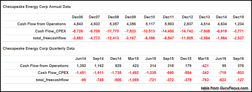
The U.S. shale oil and gas industry hasn't made any real money since 2009.  This is especially true for one of the largest natural gas producers in the United States.  Chesapeake Energy, which is the second largest natural gas producer in the country, hasn't made a lousy nickel for at least the past ten years:
Chesapeake Free Cash Flow Table
This table comes from the website, gurufocus.com.  If you click on the Chesapeake Free Cash Flow link at gurufocus.com, you will see the very same table by scrolling down the page.  According to gurufocus, their definition of Free Cash Flow is the following:
Free Cash Flow is considered one of the most important parameters to measure a company?s earnings power by value investors because it is not subject to estimates of Depreciation, Depletion and Amortization (DDA).  Over the long term, Free Cash Flow should give pretty good picture on the real earnings power of the company.
As we can see in the table above, Chesapeake Energy is completely in the RED as it pertains to free cash flow or real profits since 2006.  This is quite an amazing accomplishment from the second largest natural gas producer in the country.  You would think, being BIG would guarantee profits.  I gather someone forgot to tell Chesapeake's management the important financial tidbit called, "Economies of scale."
To get an idea of the top five natural gas producers in the United States, I listed them below.
Top 5 U.S. Natural Gas Producers (Data from Natural Gas Supply Association):
[Figures shown in billion cubic feet per day]
    ExxonMobil: 3.105 Bcf/day
    Chesapeake: 2.971 Bcf/day
    Southwestern: 2.208 Bcf/day
    Andarko: 2.164 Bcf/day
    EQT: 1.855 Bcf/day

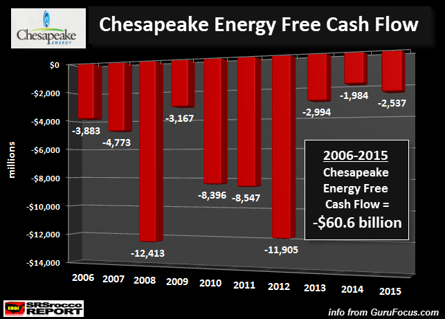
I took the data for Chesapeake's free cash flow and made the chart below:
Chesapeake Free Cash Flow Chart
While the gurufocus.com table above is nice, this chart provides us a much clearer picture of the DISASTER taking place at Chesapeake Energy.  Not only do we see a lot of RED in the chart, we can also see the total cumulative negative free cash flow for the ten-year period.  Chesapeake Energy spent a whopping $60 billion more than they made from operating cash.
Basically, Chesapeake hoodwinked a lot of investors out of their hard-earned money to help make America, energy independent.... or at least they tried.  Unfortunately, many of these investors still don't realize they have been bamboozled.  Why?  Because a lot of Chesapeake's debt, as well as many other shale energy companies' debt, are bonds purchased and held by many public and private pension and retirement funds.
And... it gets even worse.  I've read that insurance companies have invested in the Great U.S. Shale Energy Ponzi Scheme.  This is quite surprising as insurance companies are supposed to invest in very safe and conservative assets.  However, the ultra-low interest rates at the banks, thanks to the Clowns at the Fed, have forced investors and institutions to search for "Higher yielding" investments.  While the shale oil industry hasn't really made any money, at least they pay their bond holders a higher rate than many other investments in the market.
Regrettably, when investors or institutions try to get their initial shale energy investments back in the future, they will be for a rude awakening.
More Nails In The Chesapeake Energy Coffin
Before I continue, we must remember that Chesapeake Energy is the second largest natural gas producer in the United States.  That being said, let's look at few more troubling signs at Chesapeake.
One of the nifty ways to fund operations if cash flow isn't adequate, is to perform STOCK DILUTION.  If the company can't make a profit, well then by God, issue more stock to a new group of poor unworthy slobs.  As they say, there's a sucker born every minute.
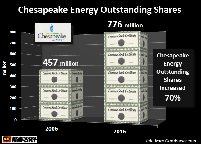
In order to do its part in making America energy independent, Chesapeake Energy diluted its shares by 319 million, or 70% over the past decade:
Chesapeake Outstanding Shares
Okay, a 70% dilution of its outstanding shares over the decade wouldn't be that bad if investors were rewarded with a decent stock price.  Sadly, Chesapeake's stock performance is just as dismal as its percentage of share dilution.  Even though Chesapeake's share price doubled since the beginning of the year, it is down 75% from its high in 2014.
Furthermore, the once mighty Chesapeake stock traded for a high of $62 in 2008, but today, trades for a mere 7 bucks a share.  WARNING...For those savvy investors who are swallowing the Mainstream media hype that a new bull market in energy stocks has begun, let me show you Chesapeake Energy's EKG... its vitals:
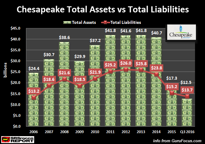
Chesapeake Energy Assets vs Liabilities
This chart should be easy for anyone to follow.  The Green Dollars represent Chesapeake's total assets and the Red Line displays its total liabilities.  For a company to get a CLEAN BILL OF HEALTH, its assets must outweigh its debts... and by a wide margin.
Well, that may have been true for Chesapeake in the past, but today we see a TERMINALLY ILL PATIENT.  In the third quarter of 2016, Chesapeake's total liabilities were higher at $13.7 billion versus its total assets of $12.5 billion.  Gosh, I wonder who owns the $9 billion of Chesapeake's long-term debt?
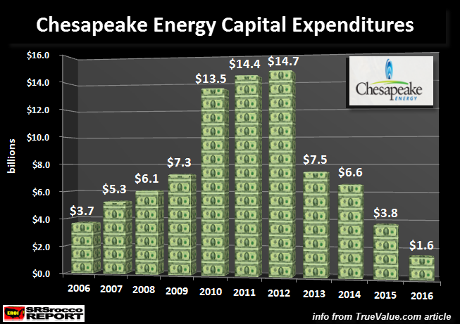
Okay, well maybe there's a slight chance that Chesapeake can begin to work harder at producing profits by increasing its natural gas production.  To do this, they would have to spend more money.  If we look at the chart below, we see another disturbing trend:
Chesapeake Captial Expenditures
According to the figures above, Chesapeake's capital expenditures are down a stunning 90% at $1.6 billion, since its peak of $14.7 billion in 2012.  This is definitely heading in the wrong direction.
By looking at all the financial indicators, the future for Chesapeake Energy looks quite dim.  Unfortunately, these indicators only provide part of the DISASTER taking place in the Good ole U.S. of A.
Chesapeake Energy Survived By Slashing Royalties To Property Owners
While Chesapeake Energy had to resort to spending $60 billion more to fund its business than it made from operations, on top of massive share dilution... this just wasn't enough.  According to several sources, Chesapeake Energy decided to slash its royalty payments to the land owners to help make America energy independent once again.
Don Feusner ran dairy cattle on his 370-acre slice of northern Pennsylvania until he could no longer turn a profit by farming. Then, at age 60, he sold all but a few Angus and aimed for a comfortable retirement on money from drilling his land for natural gas instead.

It seemed promising. Two wells drilled on his lease hit as sweet a spot as the Marcellus shale could offer—tens of millions of cubic feet of natural gas gushed forth. Last December, he received a check for $8,506 for a month’s share of the gas.

Then one day in April, Feusner ripped open his royalty envelope to find that while his wells were still producing the same amount of gas, the gusher of cash had slowed. His eyes cascaded down the page to his monthly balance at the bottom: $1,690.

Chesapeake Energy, the company that drilled his wells, was withholding almost 90 percent of Feusner’s share of the income to cover unspecified “gathering” expenses and it wasn’t explaining why.

“They said you’re going to be a millionaire in a couple of years, but none of that has happened,” Feusner said. “I guess we’re expected to just take whatever they want to give us.”
In another article, I watched a short video on just how bad the farmers and landowners were getting screwed by Chesapeake.  One farmer received $1.10 royalty check one month, and then $0.10 the next.  What was really shocking was that one landowner received a bill for $30,000 from Chesapeake, instead of a royalty payment.  This was in the Pennsylvania Marcellus area.  You have to watch this video from PA Royalty Ripoff below:
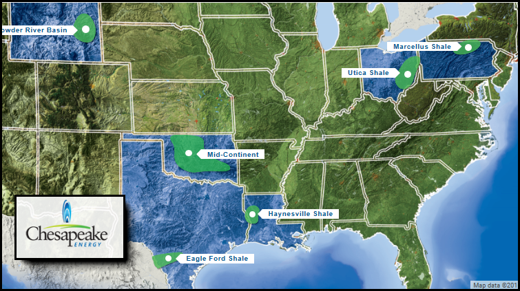
In addition, there have been several large class action royalty payment lawsuits against Chesapeake in various states in which they are producing oil and gas.  Here is a map of Chesapeake's operations:
Chesapeake Operations Map
Supposedly, the Marcellus is the largest and most profitable shale gas field in the United States.  Of the 43 billion cubic feet per day of U.S. shale gas production, the Marcellus is producing 18 billion cubic feet per day, or 42% of the total.
But, as several Americans in the video explain, they haven't been receiving their royalty payments even though Chesapeake continues to extract gas.  While other companies are actually paying their landowners their fair share of royalties, the situation in the entire U.S. Shale Energy Industry isn't much better than the financial catastrophe taking place at Chesapeake.
U.S. Shale Energy Industry Has Been In The Red Since 2009
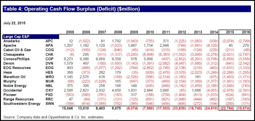
I found this wonderful table in an article, Oil Industry Spending Too Much; Deficit Spending Is Unsustainable, on the free cash flow for the Large Cap E & P oil and gas companies in the United States.  If there is one chart you have to see, this is the one:
Large Cap Energy Operation Cash Flow
This chart gives us a true picture of the DISASTER taking place in the U.S. Shale Energy Industry.  While I have focused this article on the second largest shale gas producer in the U.S., we can clearly see that the entire group lost money in 2012/2014, and the industry as a whole has been in the RED since 2009.
What is even more amazing about the figures in this table is that the Large Cap Shale Producers suffered higher losses (negative free cash flow) when the price of oil was at its highest prices from 2011 to 2014.  Even though the price of oil began to fall in 2014, the average price for the year was $93.
Furthermore, the table also shows a forecast for continued negative free cash flow for the entire industry in 2015 and 2016.  Thus, the U.S. Shale Energy Industry will have been in the RED for eight consecutive years.
Today, the price of oil is trading half of what it was in 2014 at $49-$50.  While some analysts are pointing to "increased efficiency" and "lower production costs", this won't save the industry as it is still producing an INFERIOR and UNECONOMIC quality of oil and gas.
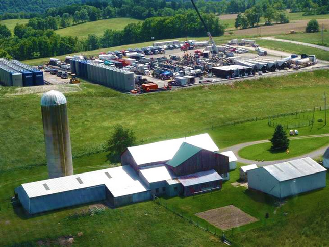
As I mentioned in my interview on the X22 Report, the amount of damage taking place on the U.S. roads and landscape by the Shale Fracking Industry is off the charts.  Here is a picture from the article linked above showing the huge FOOTPRINT that one shale gas well has on a farmer's property:
Farmers Shale Gas footprint
Can you imagine looking at that everyday on your picturesque farmland?  What is even worse, you have to look at that when the company isn't even paying your royalty payments.  Of course, when the well is finally producing shale gas, most of this equipment will be gone, but the size of the drilling pad is huge.
Moreover, the amount of damage done to local and state roads by the Shale Fracking Industry is huge.  According to the excellent research by the Energy Policy Forum,
Pennsylvania collected $204 million in impact fees in 2012 (they don’t have a severance tax), but road damage topped $3.5 billion! Since 2009, Arkansas received $182 million in gas severance taxes, but estimates road damage cost $450 million.
Well there you have it.  Fracking shale gas in the Pennsylvania Marcellus generated $204 million in impact fees, but the road damage topped $3.5 billion.  What a deal.  From the information I have read, it takes an estimated 1,600 truck trips for a single fracked well.
As we can see from all the information and data provided in this article, the Great U.S. Shale Energy Industry has been a complete failure.  Moreover, we are witnessing the U.S. Shale Gas Industry, COUNTDOWN to DISASTER.  When the industry finally implodes, who will pay to properly cap the tens of thousands of fracked wells??  Who will fix the roads?  What happens when the natural gas-electric generation supply drops considerably?
Yes, that is correct.  The United States will be in serious trouble.  However, Americans today have no clue that the U.S. Shale Energy Industry has made no real money, ripped off landowners of their royalty payments, polluted groundwater and destroyed countless roads across the country, all in the effort to make us "Energy Independent."
Well done....
Check back for new articles and updates at the SRSrocco Report.

Fonte: qui

P.S.: potete usare la funzione TRANSLATE di Google(sulla colonna di destra), selezionando prima un qualsiasi linguaggio e poi successivamente, l'italiano, per avere la traduzione automatica.